wwwhat we do
Responsive Web Design
In a digitally savvy world, mobile phones and tablets are ubiquitous. Gone are the days when online content was only accessible through laptops and desktops. Today, every customer wants to be able to browse a website conveniently on any platform as and when needed.
According to a statistical report, “Mobile accounts for approximately half of the web traffic worldwide. In the first quarter of 2019, mobile devices (excluding tablets) generated 48.71 per cent of global website traffic alone. And India is a prime example of a market with a significant mobile-first online population.”
This just shows that if you’re not accessible via smart-phone or tablet, you lose out on a very basic edge.
Honestly, it will be a waste of time if we as a responsive website designing company in Delhi were to create a different design and development phase for each existing or new device in the market.
So, how do we go about it?
Simple, by helping you be responsively relevant for the audience. Being a renowned responsive web design company in India, Olive understands the importance of designing responsively fulfilling designs that can navigate on any device in any size. We create a digitally compelling experience for the user by enabling them to check out whatever they want on a website without worrying about resolution, pixelation, speed and much more.
Your website is responsive if it is
-

Diversified
The methods of accessing a website without removing necessary call-to-actions should be increasingly and significantly more. Understand how users will interact and accordingly make it as fluid and flexible as possible for them so they enjoy a consistent and accessible experience.
-

Switchable
The audience should be able to switch from portrait to landscape mode in a jiffy through responsive web design development. The web pages should be efficiently compatible with a tablet, smart-phone, iOS device as well as a multitude of devices and screen resolutions.
-

Device-friendly
It is not just about mobiles, if your website is accessible across various devices, it goes a long way in generating visibility, saving costs, managing time and not to forget, achieving an outstanding online persona to reach the audience you want to.
-

Optimized
We understand every aspect of a visitor’s user experience and work towards offering greater versatility in the browsing experience. Google bots are very efficient at recognizing such responsive and optimized sites and tend to rank them highly on search engine results.
Ready to become responsive with Olive?
Elements listed above are just few fundamentals that state how effective making a website responsive can be. But, there are various other factors that come into play. From enabling an efficient loading time, to having a narrower layout, from deciding upon touch target elements to optimizing graphics, from highlighting navigational links to maintaining functionality and quality; each of the pages have to be created with clear readability, adaptability, fluidity, and a seamless user experience. And being amongst the best website designing companies in Delhi, websites are kind of at the core of who we are.
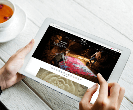
Few Glimpse of Our Website Responsive Work
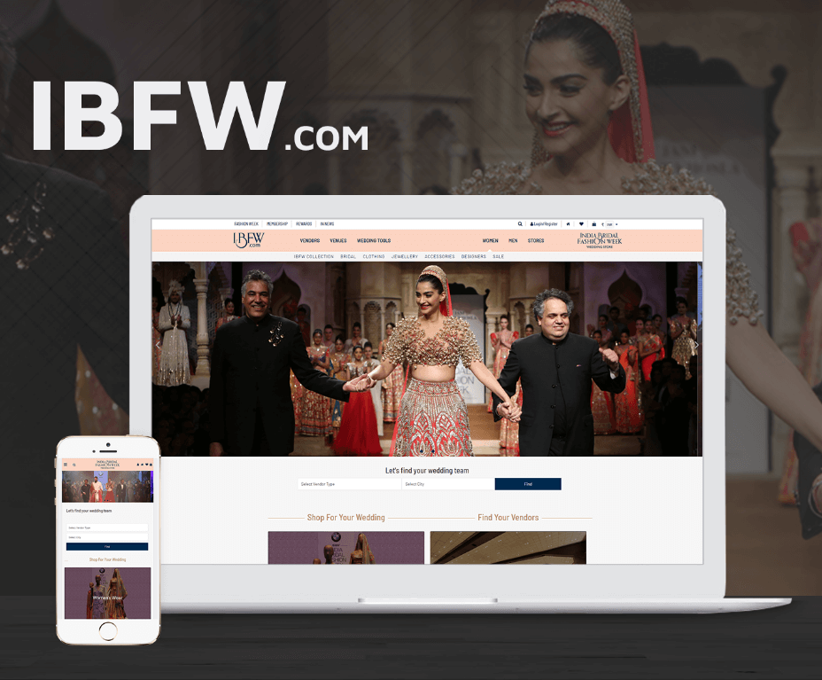
IBFW
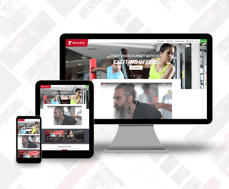
Fitness First
Hands
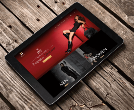
Mescos Shoes
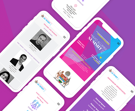
Mayo Alumni